Hey guys i have attached all the key
emails from Duncan, with all the information and drop box invitation.
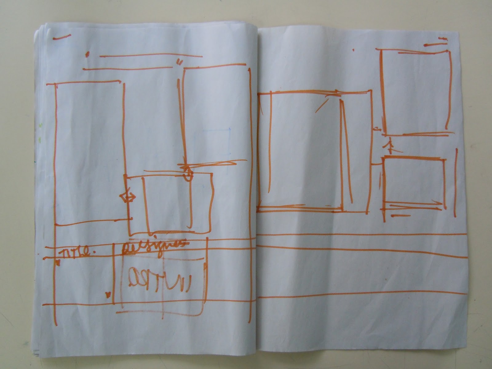
as well as their names and the basic structure for the year book that
we worked out the other day!
Hope this helps,
need anything else let me know!
Robyn
________
Hi Robyn,
Paul forwarded me your request for
info for the textiles year book. Apologies it is so late but date and time of
night, v hectic, still no excuse though, here you go... any probs then feel
free to e-mail or pop in.
------
Hey Paul,
Hope you are well. Thank you for sending
the introduction though, i received it after i saw you yesterday.
I thought i would just send a list
through of what we still need by Thursday 29th March:
1. Names
Please find attached excel sheet with these
2. Emails
We are not putting everyones e-mail
address (because loads of them haven't given it) so we are going to use 1
common address and strap line -this will include a portal web address
that takes them to each of their own personal webpages and allow them to have a
far greater platform to showcase the work then they could individually have in
the book.
We will have it read along the lines
of....
3. 7 Disciplines
(6 here and 1 to follow - they are good
to go alhtouh we may edit a word etc to avoid widows or fit your design
layouts)
Material Culture
Striving towards reified understanding,
we engage in dialogue and investigation of the relationships between the
physical artefact, process and contextualisation. Our journeys with
material culture define and legitimatise new approaches and perspectives, from
a centric stance, we broaden our considerations of consumption, history, the
other, place or material avenues et alia as cognitive and empirical avenues of
practice.
Drawing & Colour
Development and design through
experiencing the relationship and physical ontology of process. As we
communicate our ideas, experiences and ambitions visually, we engage in the
origins of the haptic; to wit, the value of the honest labours of drawing, the
process and tactility of direct intervention in its broadest contexts. We
explore, narrate and resolve, through these the most experiential of processes,
with colour and mark, gesture, space and theme, we bring joy, vitality and
realised visual harmonies to an otherwise world of discord.
Historical & Conservation
Acknowledging through an ebullient
appreciation, our design heritage and history, we as designers identify and
locate our practice. From such contextualisation’s we can navigate a journey
which embraces and legitimatises our practice. We desire to treasure, honour
and preserve this heritage through both the physical artefact and laboured interpretation.
Ecology & Sustainability
Albers, in discussing the ‘Vorkurs’
spoke of the need that “Materials must be worked in such a way that there is no
wastage: the chief principle is economy. The final form arises from the
tensions of cut and folded material”
Terms such as upcycling, sustainability,
eco and design-futuring underpin the philosophy and considerations of our
response to environment within design. Encouraged to explore these values, it
is the intention of sustainable design to identify with wider contexts,
globally and locally, to explore viable and sensitive practices, to create an
aesthetic harmony, in which neither process, material or visual outcome is
subordinate in concern.
Slow-Crafting
Xavier Girard referred to ‘... the
intrusion of modernity into the everyday world…’, as society seems to ever
increasing lean towards fast production, emphasis on mass, and cheap labour, we
seek to reconcile beautiful craftsmanship with production. We denounce the
mundane through a celebration, consideration and inventiveness to usher in a
new, heralded philosophy of slow-crafting. We engage with a practice beyond
mere concepts of ‘hand worked’ against ‘machine, or the time taken to produce
an article. It is ephemeral, a respect for process, tradition and quality of
craft, aesthetically realised with a richness of applied knowledge.
Culture
We speak of culture in design, its
physicality, its modus operandi, its language. We define our physical
environment in its constructed purpose-built spaces, cultures of success, we
articulate as emerging from strong social and subject discipline values, our
language, embedded in the visual recognition of abstraction, expression and
reified forms.
Progressive Technologies - to follow
later tonight.
4. Blog Adresses
Refer to the e-mails - we will go via
the artsthread site as a homepage for all the graduates webpages/blogs and such
like.
5. Photographs from the show (if they
are on a memory stick, i can come pick them up whenever they're available)
We have a good number for your
consideration and you can either pop along Thurs AM or if you would prefer i
can put them in 'dropbox' for your convenience?
Thank you!
Kind Regards,
Robyn Russell